Back to Home
simplestream’s
new tv
ui
Within the same App Platform branch, we collaborated on redefining the Simplestream White Label TV UI.
overview
Simplestream's white label TV interface was falling behind modern streaming competitors. Our team of two UX designers was tasked with creating a revamped UI to match industry standards, improve usability, and help win more client deals. My role was to lead the project, rapidly prototype solutions, communicate with developers, make design decisions, and ensure design consistency.
The goal was a scalable system that could evolve with Simplestream's needs.
why the redesign
Despite the ease of use in the current generation, our UI was seen as outdated during competitive pitches. Prospective clients repeatedly compared our offering unfavourably to the sleek, modern designs of competitors, and we were losing business as a result.
In addition, our codebase (TAL) was deprecated and causing technical issues, especially on modern smart TVs.
We needed a design that was both visually appealing and technically robust, in line with current trends and our design language.

my role
⭐️ Project Leadership
Led the project from early planning and rapid prototyping to direct communication with the development team.
🖌️ Design ConsistencyDesign Consistency
Ensured every design element aligned with the 8px grid system and overall design rules, down to the minutest detail.
🤝 Collaboration & Final Sign-Off
Collaborated with my colleague who developed new screens, while taking responsibility for the final sign-off.
Verified that every element worked seamlessly and accounted for edge cases (e.g., varying title lengths, missing descriptions).
✅ Quality Assurance
Employed a rigorous approach to ensure a consistent and polished final product.
impact
In today’s fast-paced digital landscape, a modern and intuitive user interface isn’t just a luxury—it’s a necessity.
Our redesigned UI is set to make a significant impact across all stakeholder groups, driving engagement, enhancing marketability, and positioning our company for future success.
👤 For User
The new interface promises an engaging and intuitive experience, allowing users to effortlessly navigate and discover content.
This user-centric design not only simplifies interaction but also creates a more enjoyable and efficient journey through the platform from good design.
👥 For Client
By upgrading the product’s visual and functional appeal, we enhance its marketability and competitiveness.
Clients now have a stronger platform that not only meets modern standards but also drives higher user engagement, ultimately supporting potential growth in subscriptions and broader market reach.
💥 For Simplestream
Addressing longstanding criticisms of our previous, dated UI, this redesign serves as a strategic move to reposition the company.
By meeting modern expectations, we are better equipped to secure new deals and partnerships, reinforcing Simplestream’s commitment to innovation and excellence.
problem statement
key
issues
❌ Outdated Aesthetic
Although users could access content quickly, the overall visuals felt stale and uncompetitive vs Amazon Prime or Netflix. We needed to align our appearance with industry standards.
❌ Navigation Limitations
The top-positioned navigation bar, though clear, lacked the modern flexibility and intuitive feel of current streaming services.
❌ Technical Constraints
Built on the deprecated TAL codebase, the old UI was prone to performance issues (e.g., problematic typography and animation handling) and was not future-proof, especially for the newer generation of smart TVs.
impact
on business
While the original design did not hinder usability in a basic sense, its lack of visual appeal negatively influenced user perception.
For potential clients, the “old” look suggested a product that couldn’t compete with the visually striking interfaces of market leaders. This disconnect affected our ability to win new business and left a clear mandate for redesign.

research and inspiration
research
methods
Before diving into the design process, it was essential to build a strong foundation through extensive research and inspiration. This phase helped us understand the current landscape and informed every design decision moving forward.
Our approach included:
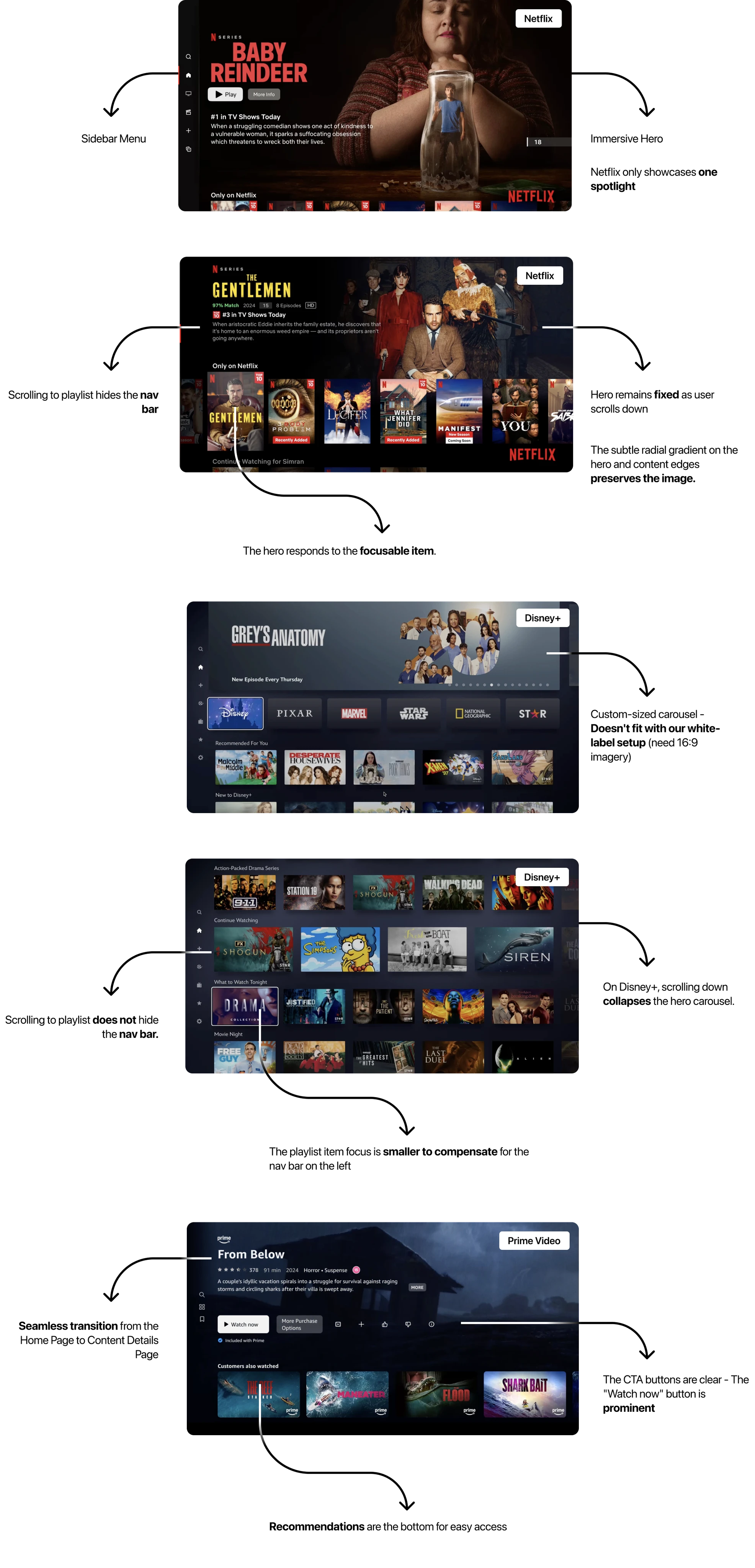
👉 competitive analysis
We analysed modern TV apps such as Netflix, Amazon Prime, ITVX, and BBC iPlayer. This helped us understand industry trends regarding navigation, content hierarchy, and animations.
Analysing common UI trends such as intuitive navigation structures and content hierarchies.
Creating mood boards and capturing screen recordings to document key design elements like animation, carousel transitions, and layout responsiveness.
Collaborating closely with internal stakeholders—including developers and the CPO—to gather practical feedback and identify technical constraints.
👉 Key Insights and Their Influence
Our research reaffirmed that a modern TV UI must balance fast content access with a visually engaging experience. For example:
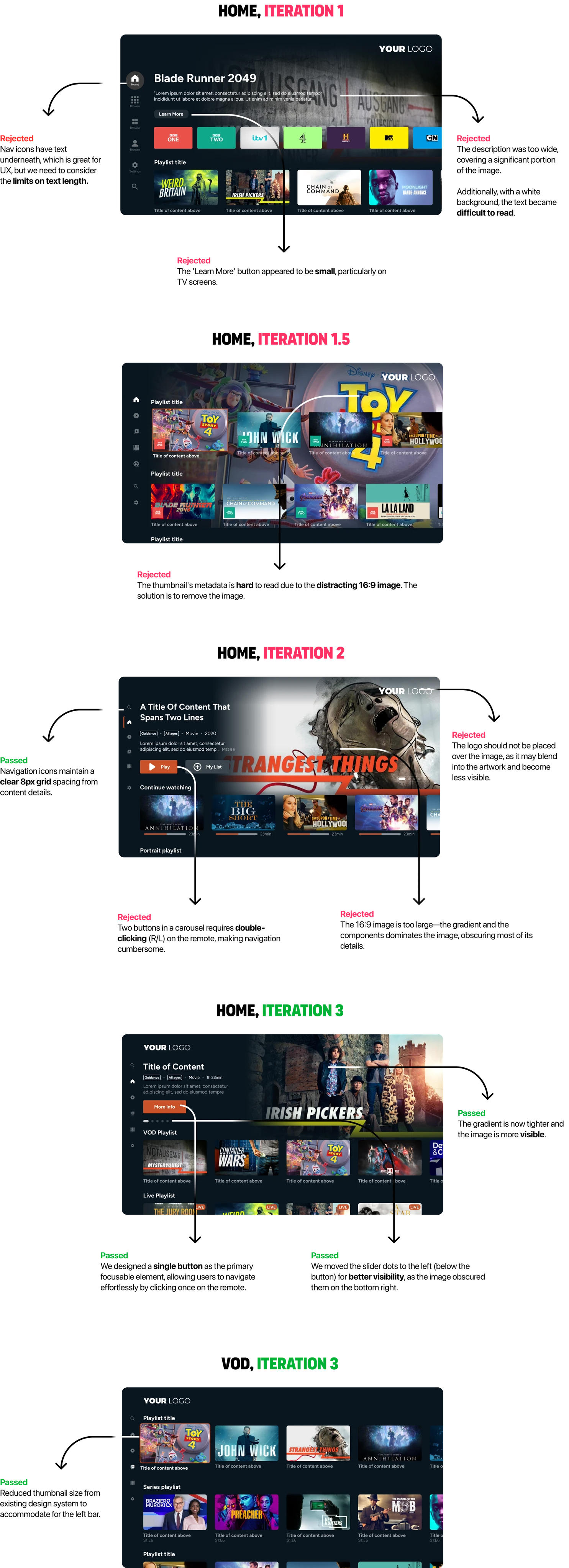
Navigation: Modern UIs often favour a sidebar menu over a top bar to free up space, give some screen real estate and enhance content focus.
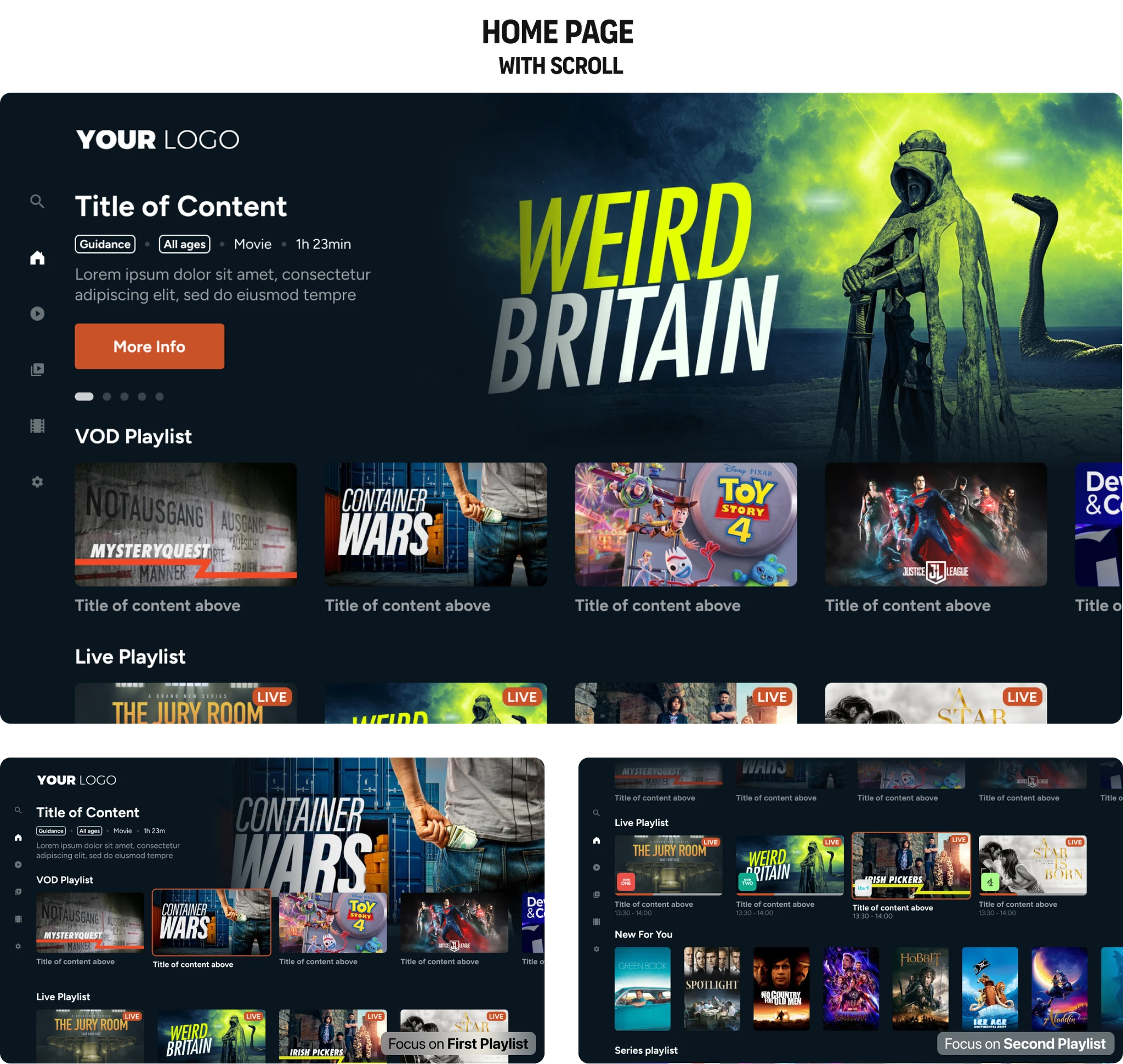
Hero Carousel: Inspired by Amazon Prime’s design, we transitioned to a full-width hero that adapts dynamically as users navigate the content.
Consistency: Retaining core components from our design system was crucial to ensure a seamless transition while allowing for future scalability.
Accessibility & Performance: We adjusted elements like gradients and thumbnail sizes not only for aesthetic consistency but also to meet accessibility guidelines and ensure smooth performance on older hardware.
design process
our
ethos
✅ Simplicity
Crafting a clean, uncluttered layout that allows users to focus on content.
✅ Visual Hierarchy
Prioritising key content areas to create an intuitive browsing experience.
✅ Scalability
Create a modular design that accommodates future updates and customisations
design
decisions
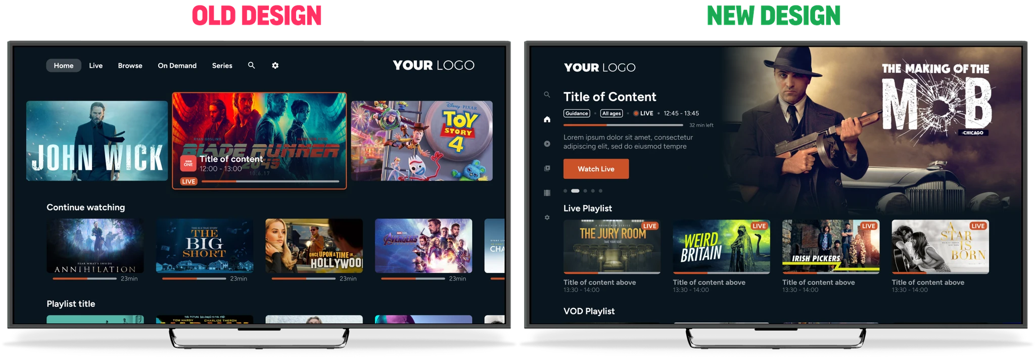
👉 Navigation Shift
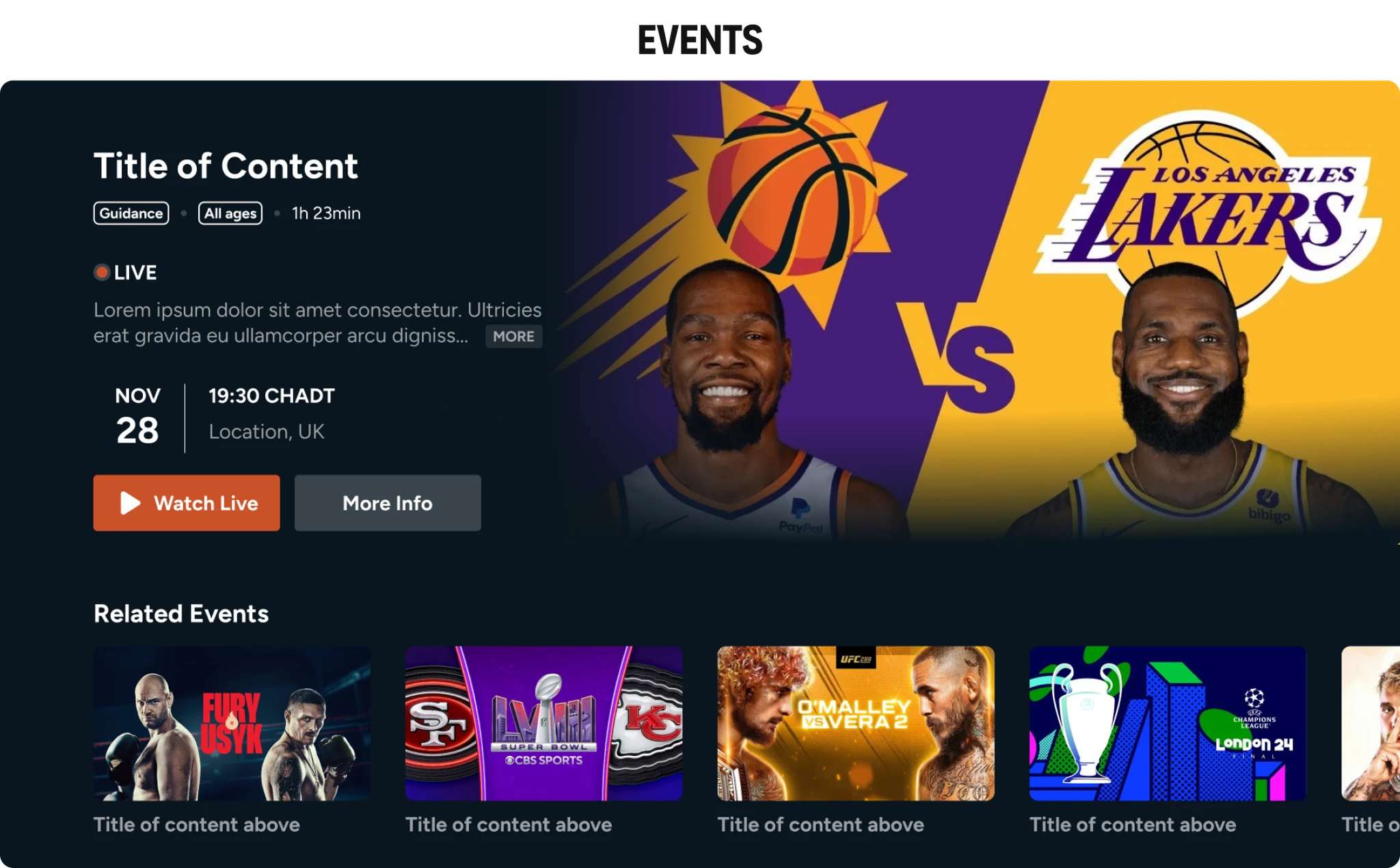
We moved the navigation from the top of the screen to a left-hand sidebar featuring clear, icon-based options. This change not only modernised the look but also improved accessibility during content navigation.
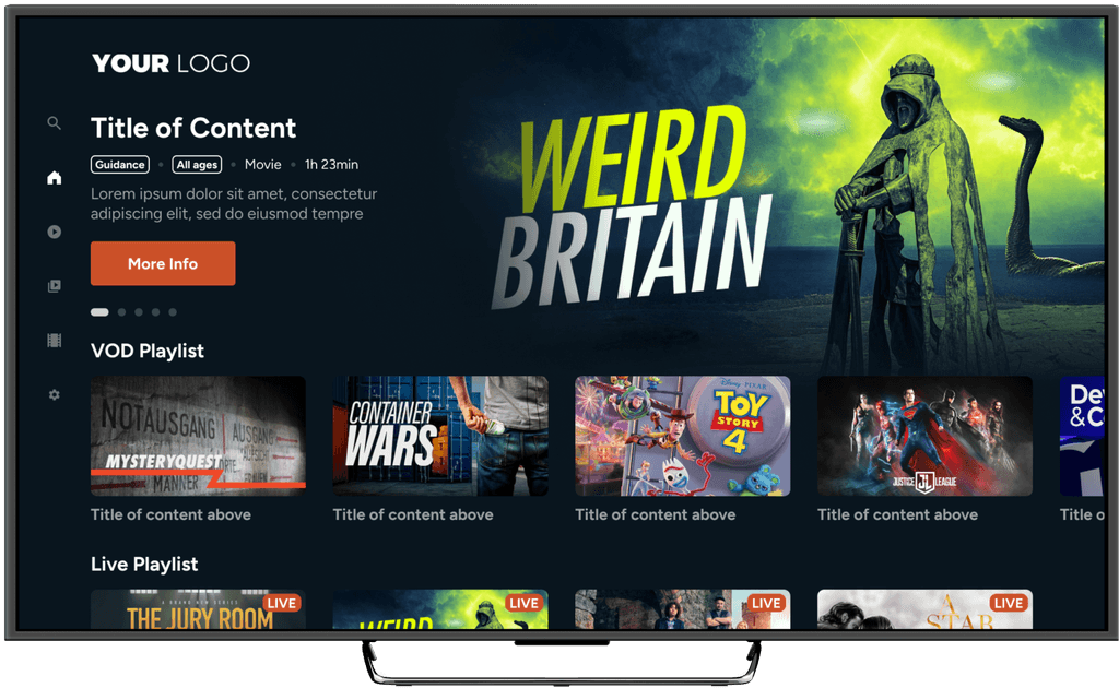
👉 Hero Carousel Redesign
Transitioning from a three-carousel approach to a full-width hero inspired by Amazon Prime, we allowed for seamless transitions as users navigate through content.
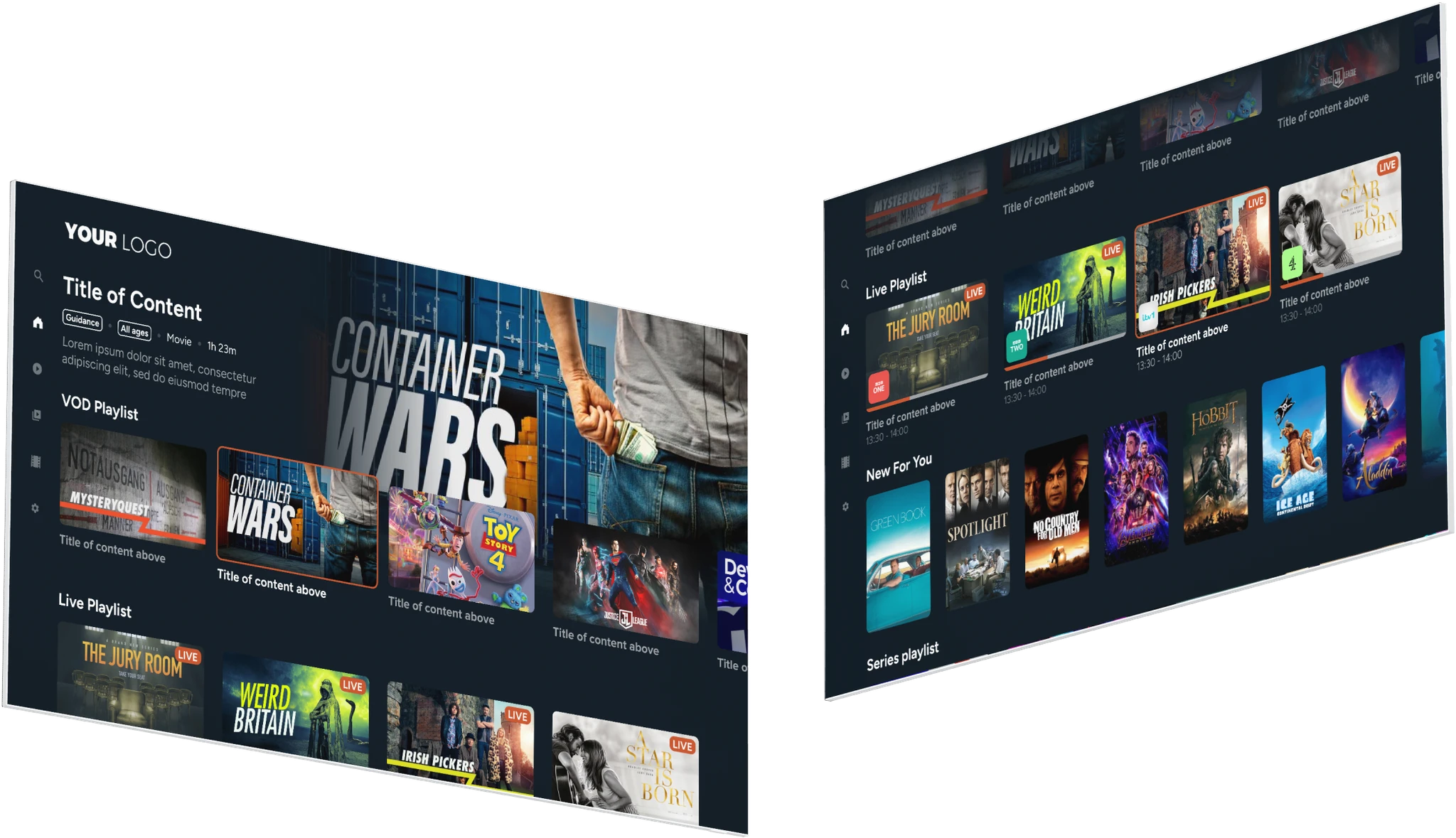
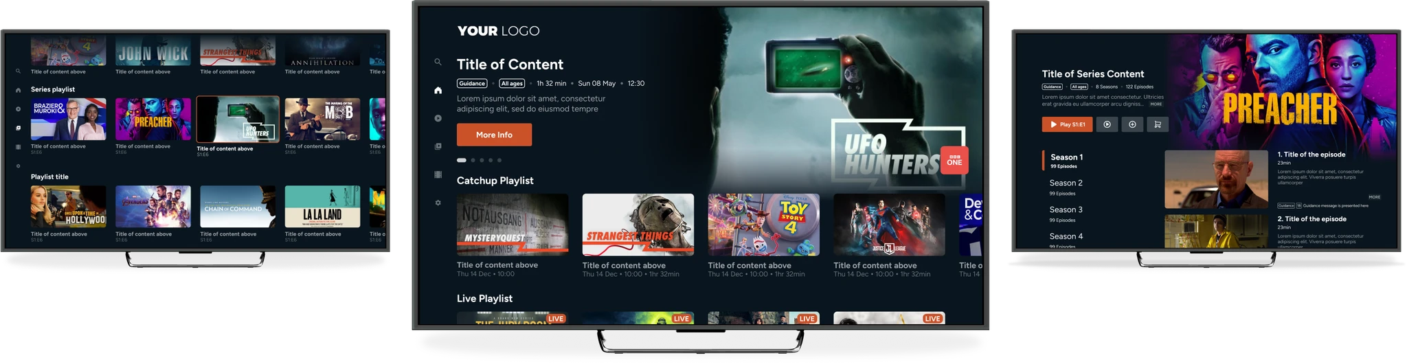
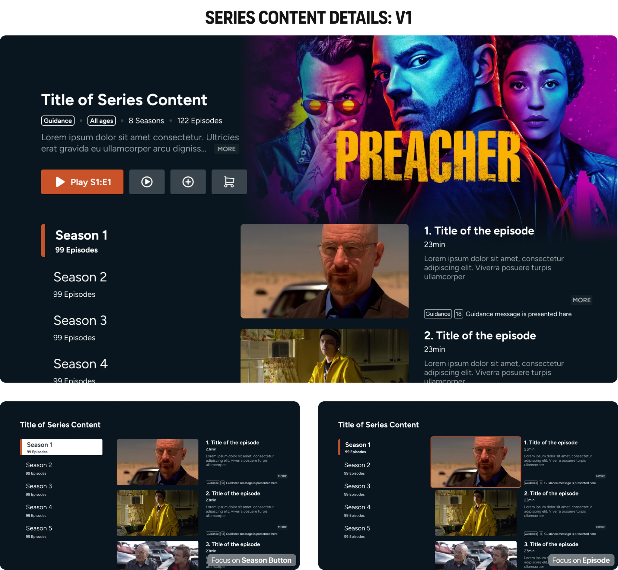
👉 Content Layouts
While the underlying components (like playlists and thumbnails) were retained, we refined their presentation—reducing thumbnail size on focus to prevent overlap with the sidebar and adjusting gradients for better image visibility.
👉 Adaptability
Our design prioritises flexibility, allowing the system to seamlessly transition between a collapsing hero, a sticky hero for future needs, or even a full-width Disney+ style carousel.
👉 Accessibility Considerations
In light of impending accessibility regulations, we chose color tokens and font sizes that adhere to WCAG guidelines, ensuring a compliant and inclusive design.
consistent
usability
Every design decision was rigorously tested.
For instance, after feedback on the harshness of the gradient in the hero carousel, we revised it to better balance image clarity with aesthetic appeal. Detailed internal testing (including remote navigation simulations) ensured that each component, from text sizing to button placements, worked seamlessly within our design system.
challenges
Every design project comes with its own set of hurdles - whether it’s balancing creative vision with technical constraints or ensuring the interface works seamlessly across various devices.
In redesigning Simplestream’s TV UI, we encountered several notable challenges that tested our problem-solving skills and design adaptability. Through a combination of iterative testing, close collaboration with developers, and a commitment to refining every detail, we tackled these issues head on.
major
challenges
👉 Edge Case Complexity
One of the toughest challenges was accounting for a myriad of edge cases—from unpredictable text lengths to varying image dimensions (16:9 vs. 2:3) and missing metadata. We documented over 20 potential scenarios and iteratively tested each one through design.
👉 Performance vs Aesthetics
Balancing modern visual effects (like animations) with the processing limitations of older TV models meant making careful choices to avoid performance degradation.
👉 Navigation Usability
We had to get creative in redesigning the navigation to remain accessible even when users were deep within content carousels. Through multiple prototypes, we explored various solutions, including mapping the remote’s “left” button for an intuitive return to the sidebar.
our
solutions
✅ Iterative Testing
By leveraging rapid prototyping and developer feedback (even using AI tools for additional insights), we refined each design element until it met both aesthetic and functional requirements.
✅ Performance Optimisation
We chose subtle animations and precisely adjusted visual effects, avoiding blur on overlays, to ensure a smooth user experience on all devices.
✅ User Flow Refinement
We meticulously planned remote interactions and tested various navigation behaviours to make transitions between content and the sidebar smooth and intuitive.
influence
on design
These challenges forced us to dig deep into the details and iterate extensively, ultimately resulting in a design that is robust, visually appealing, and highly usable. Each hurdle taught us to balance creativity with practicality, ensuring that our design was both innovative and feasible.
outcome and impact
what we
did
🖌️ Clean, Modern Aesthetics
The redesigned UI delivers a visually appealing experience that aligns with modern streaming platforms.
💡 Intuitive Navigation
The left-hand sidebar and refined carousel enhance content discovery, making the app easier and more enjoyable to use
🔮 Future Proof
The scalable, modular design system means the platform can evolve with future requirements and technology updates.
EXPECTED
impact
As the project is still in development and no data is available yet, the implementation of our updated design system is expected to deliver three key outcomes:
Increased Engagement
An intuitive layout and dynamic visuals are anticipated to boost user engagement and content consumption.
*Internal Research
Improved Client Appeal
The modern design enhances market position, potentially boosting subscriptions and business outcomes.
*Internal Research
Enhanced Accessibility
Compliance with WCAG guidelines ensures that the interface is accessible to a broader audience, meeting both current and upcoming regulations.
*Internal Feedback
stakeholder
feedback
Internal stakeholders - including developers, the CPO, and client-facing teams - provided overwhelmingly positive feedback.
They praised the design for its balance between innovation and familiarity, noting that it elevates Simplestream’s offering and sets the stage for future enhancements.


reflections and learnings
key
learnings
👉 Iterative Testing is Crucial
Early wireframe and prototype testing were vital in refining our navigation and interaction models before moving into high-fidelity design.
👉 Embrace Technical Constraints
Collaborating closely with developers helped us design solutions that were both innovative and technically feasible.
👉 Design for the Future
Building a modular, scalable design system ensures that future updates can be integrated smoothly without disrupting the user experience.
what id
change
Given more time, I would:
Conduct more extensive user testing to validate assumptions and further refine micro-interactions.
Explore additional accessibility enhancements to ensure the product meets and exceeds upcoming regulatory standards.
influence
on design
These challenges forced us to dig deep into the details and iterate extensively, ultimately resulting in a design that is robust, visually appealing, and highly usable. Each hurdle taught us to balance creativity with practicality, ensuring that our design was both innovative and feasible.
conclusion
👉 key takeaway
This project illustrates how a careful, research-driven redesign can transform an outdated interface into a modern, engaging, and future-proof user experience. By addressing both aesthetic and technical challenges head-on, we created a TV UI that not only meets current industry standards but is also adaptable for future growth.
👉 Showcasing My Skills
The case study demonstrates my ability to lead a complex design project—from initial research and ideation to detailed prototyping and iterative testing. It highlights my proficiency in balancing user needs with technical constraints, as well as my commitment to delivering consistent, scalable, and innovative design solutions.
👉 whats next
Moving forward, I am excited to apply the lessons learned from this project to new challenges, continually pushing the boundaries of user experience design while staying aligned with emerging technologies and industry trends.
